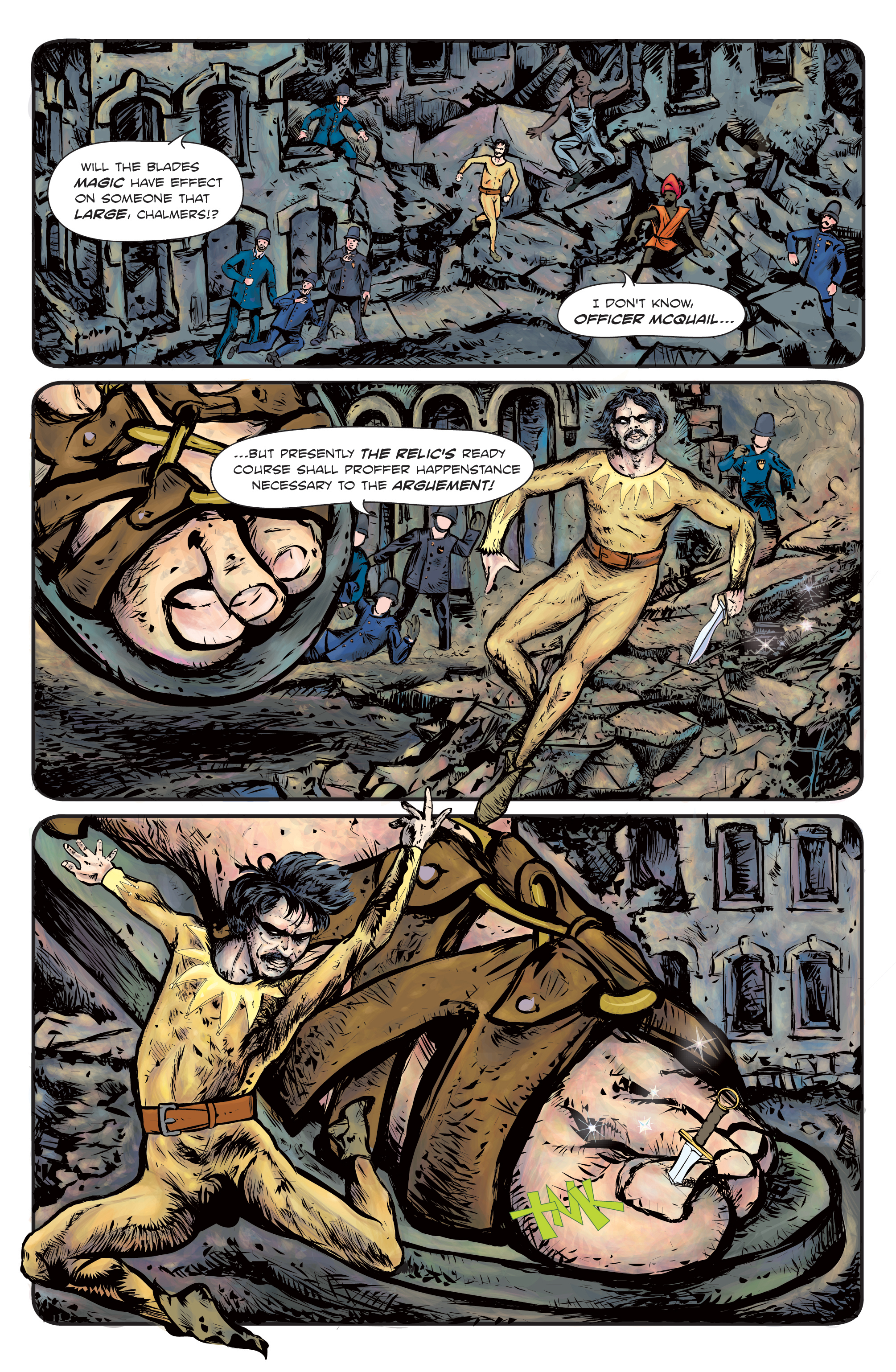
The Enchanted Dagger #2 – Page 6
I got to work on these pages in September of 2015. This series of pages was a fun one because they showcase the first real action sequence in the comic. I wouldn’t say that this is a ‘thrill a minute’ sort of action adventure story but I’ve been careful to cut the dry, rhetorical verbosity of my political antagonists with some good action set pieces. And sporadic nudity. At the time I started working on them I had spent just under a year on the book and I was trying to get through some pages fast. The logic being that the faster i get through the first three issues, the sooner i’ll get to work on the next three and then the last three. In other words, finish the book. Having gone through these pages as fast as possible, there are some things that bug me now. For example…on the last page, Page 5. These pages are built in Illustrator 10 on what are called “layers.” You can draw on a layer, or put in a shape of color, and then “add” another layer and super impose it on the last layer. As it all builds up, you get your page, word balloons, letters, page border layer, etc. Well, the last page, you might notice, was built on a great field of light blueish green. It peaks though everywhere. I was working with a full page spread for the first time in the book and must have decoded to unify the composition with the underlying green color. What I never even thought of doing before about 12 hours ago was go in and tweak that background color after the fact, something that is very easy to do in illustrator! I’m realizing that this page (and page 4) could have had a great golden hue with a brighter background color! I’m babbling on, but it goes to show. Things may need to change.

Discussion ¬