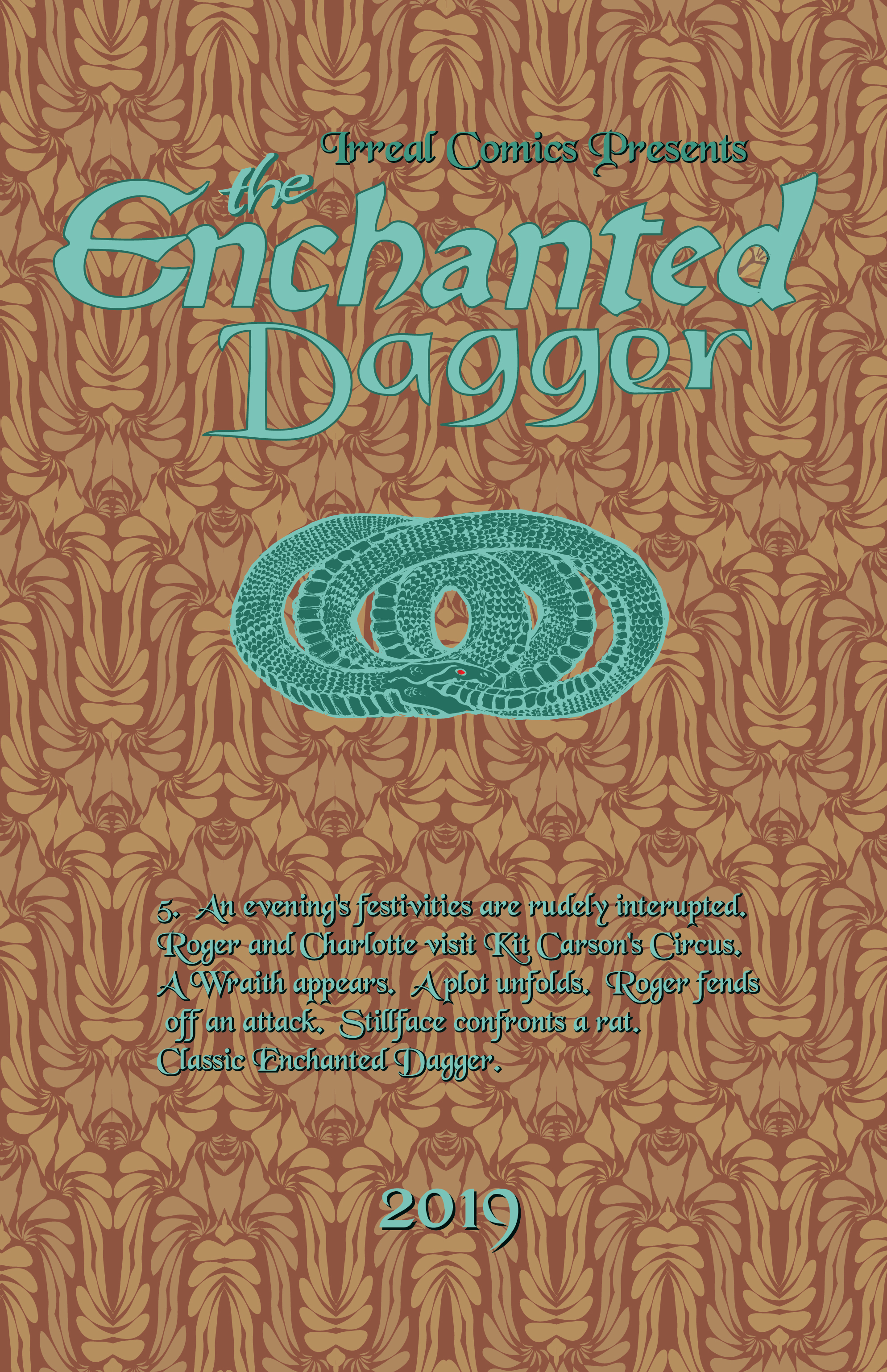
The Enchanted Dagger #5 – Interior Front Cover
I completely forgot about my interior front cover, so i whipped this up real quick. I’m sure the colors are way off and I don’t know if it will jive with page one (which I’ll post tomorrow). Getting the colors to work together is a chore. The Tourquoise lettering was getting drowned out by a brighter back ground so I I had to darken it. It might look muddy.
I’ll have all these details figured out by the time I print it, of course….
…..I’ll add that I spent most of the evening try to tweak the colors but they still look crummy.

Discussion ¬